A Tall Condensed Display Font for Bold Web Headers
I had been staring at the same hero section for three days. The boutique home decor store I was designing needed something with presence, something that could sit confidently over lifestyle photography without disappearing into the background. The client wanted personality without sacrificing clarity, and every typeface I tested felt either too quiet or too chaotic. That was when I loaded Halim into my font tester for the first time.
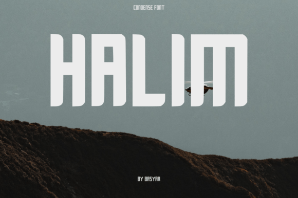
Halim is a condensed display font in all caps, built tall and bold with softly rounded corners that give it a surprisingly approachable feel. It falls squarely into the display category, meant for headlines rather than paragraphs, and the moment I applied it to the site's main banner, the layout shifted from forgettable to intentional. The letters stood upright with a narrow footprint, leaving generous breathing room on either side of the headline block, and the rounded terminals softened what could have otherwise been an overly aggressive uppercase voice.
Why a Condensed Display Typeface Changes a Layout
Most web designers know the tension between a bold statement and a crowded layout. Hero sections often fight for space against navigation bars, product images, and call-to-action buttons. A wide, extended headline can eat up horizontal real estate quickly, pushing supporting elements out of view or forcing awkward line breaks on smaller screens. Halim sidesteps that problem by being tall and narrow by design. Each letter occupies less width while maintaining a strong visual weight, which makes fitting long headlines into tight grid columns far more manageable.
On the boutique store project, the homepage banner needed to read "Curated Spaces, Conscious Living" over a full-width photograph of a sunlit living room. With the previous font choice, the headline either shrank to an apologetic size or wrapped awkwardly across three lines. Halim sat comfortably on two lines at a substantial point size, and the condensed structure meant the text never overlapped the focal point of the background image. That alone changed how the page breathed.
Rounded Corners and Brand Warmth
Condensed display fonts often lean cold and industrial, with sharp angles that feel at home on a tech dashboard but out of place on a lifestyle brand. What separates Halim visually is the gentle rounding on its corners. It is a subtle detail, almost easy to miss when scanning quickly, but it registers emotionally. The typeface communicates strength without stiffness, confidence without aggression.
For the home decor store, this balance was essential. The brand identity relied on natural materials, soft textures, and an inviting tone. A razor-edged sans serif headline would have contradicted that mood, pulling the design toward something more corporate. The rounded touches in Halim kept the voice friendly while the all-caps structure maintained authority. That combination is rare and genuinely useful for brands that want to appear professional without feeling cold.
Testing Readability on Mobile Screens
Any display font needs to pass the mobile test, and condensed typefaces demand extra scrutiny here. Letters that look crisp on a desktop monitor can blur together on a phone when the viewport shrinks and the font scales. I spent an afternoon previewing the store's landing page across device frames, adjusting letter spacing, line height, and font size to find the sweet spot.
Halim held up well at headline sizes above eighteen pixels, but I learned quickly that it is not meant for body text or small interface labels. On a product card title or a short section heading, it remained legible and distinctive. On a tiny button or a dense paragraph, it understandably became harder to scan. That is not a flaw of the typeface; it is simply the nature of condensed all-caps display fonts. The responsibility falls on the designer to use the right tool for the right layer of the hierarchy.
For the mobile version of the site, I increased the letter spacing slightly and kept Halim reserved for the primary hero headline and the category section titles. Supporting copy stayed in a clean sans serif, creating a clear separation between decorative and functional text. The result felt polished rather than forced, and the page loaded quickly since the font file was lean and easy to serve as a web font.
Using Halim Across Different Page Sections
Beyond the hero banner, I started placing Halim in other strategic spots around the project. The collection page headers, the newsletter signup call-to-action, and the announcement bar at the top of the site all benefited from the font's compact confidence. Short phrases worked best. Single words like "Sale," "New," or "Journal" popped cleanly against both light backgrounds and dark overlays.
One section that surprised me was the blog redesign component. The client wanted to feature editorial content alongside products, and the blog post titles needed distinction from the product names. Halim appeared in the featured post header at the top of the blog landing page, setting a tone that felt curated and editorial without drifting into magazine territory that might alienate shoppers. The narrow letterforms allowed longer article titles to sit in a single line within a sidebar card, keeping the layout tidy.
Pairing a Condensed Display Font with Body Typefaces
Pairing fonts is where a lot of digital projects either come together or fall apart. A striking display font can dominate everything around it if the supporting typography does not offer enough contrast. For this store, I paired Halim with a simple geometric sans serif for body copy and a neutral serif for longer editorial passages. The contrast worked because the supporting fonts stepped back and let the display typeface carry the personality.
The sans serif body font had a generous x-height and open apertures, making it easy to read on screens at small sizes. The serif added warmth to blog posts and about-page narratives. Halim anchored the hierarchy at the top, appearing only where it could make an impact without overwhelming the reading experience. That restraint kept the brand identity cohesive across every page.
When selecting a pairing, I looked for fonts that did not compete with the condensed proportions or the rounded details of the display typeface. Sharp geometric shapes clashed, while overly soft humanist fonts blurred the distinction I wanted to maintain. The middle ground, a neutral workhorse with clean lines and minimal personality of its own, proved the most effective companion.
Practical Observations for Digital Creators
Anyone who designs landing pages, online stores, course sales pages, or portfolio sites knows that typography is never a purely aesthetic decision. The right font choice influences how visitors scan a page, where their attention lands, and whether they trust the brand enough to keep scrolling. Halim, as a display font, works best when it signals something worth noticing. It draws the eye upward and forward, anchoring section beginnings and marking important transitions.
On a coaching website I mocked up to test the font further, the headline "Clarity, Strategy, Growth" sat above a calm photograph of a workspace. The condensed structure let the words occupy a narrow vertical band without cutting into the image's subject. The rounded corners took the edge off the all-caps authority, making the page feel aspirational rather than demanding. That emotional difference matters when a visitor is deciding whether to explore further or bounce.
Checking Technical Details Before Committing
Before adding any font to a client project or a commercial template, I always check the technical specifics. For Halim, the available file formats included web font options that worked cleanly across modern browsers. The character set supported the languages my client needed, and the licensing terms covered use on a single website domain without additional fees. These details are easy to overlook in the excitement of finding a typeface that fits visually, but they determine whether the font can actually be deployed in production.
I also look at included styles and weights. A display font with only one weight can still be versatile if used sparingly and paired thoughtfully, but it is worth knowing that limitation upfront. For this project, the single all-caps style was precisely what the layout required, and the consistency across the site became a strength rather than a restriction. Every headline shared the same voice, and the brand identity felt intentional because of that repetition.
Where Halim Shines in a Digital Brand Kit
A cohesive digital brand kit needs typefaces that can perform across multiple contexts while maintaining a unified personality. Halim fits neatly into the display layer of a brand system, handling website headers, social media graphics, digital ad headlines, and campaign landing pages with the same distinctive voice. Because it is all caps and condensed, it reads quickly in short bursts, which suits the way people scan digital content.
For a product landing page, the font can define the offer headline and the key benefit statements beneath it. For an online shop banner, it can announce seasonal collections without competing with product photography. For a course sales page, it can frame transformation statements in a way that feels bold but not brash. The versatility comes from restraint, using the font only where its personality adds value and stepping back everywhere else.
A Few Lessons from Real Layout Testing
Spending real time with a font inside actual layouts teaches things that font previews cannot reveal. Here are a few observations from working with Halim across multiple screen sizes and page types:
- Give condensed all-caps text enough breathing room. Tight margins make the letters feel cramped and reduce the impact of the rounded details.
- Contrast is your ally. Pair the display font with a much simpler body typeface to create clear hierarchy without visual competition.
- Test on dark backgrounds early. The bold weight holds its shape well against dark surfaces, but letter spacing may need adjustment for optimal legibility.
- Use it for short, punchy phrases. Single words, three-word headers, and concise call-to-action lines are where the font performs best.
- Avoid setting body copy in a condensed all-caps typeface. Reading fatigue sets in fast, and scanability drops sharply on mobile devices.
These are not rules handed down by a design authority; they are simply what the layout taught me through iteration. Each project will have its own demands, but starting from these observations saves time and prevents common missteps.
The Quiet Impact of Thoughtful Typography
Visitors rarely notice a font choice directly, but they feel the result. A site that uses typography well feels easier to navigate, more trustworthy, and more aligned with its stated purpose. A headline set in Halim might not prompt someone to comment on the typeface, but it will contribute to an impression of polish and care. That is the quiet work of good design, happening beneath conscious awareness but shaping the entire experience.
For web designers, UI designers, and digital product creators, the search for display fonts that balance personality with usability is ongoing. Halim earns its place in that conversation through its condensed structure, rounded warmth, and all-caps clarity. Whether used on a boutique store, a coaching site, a portfolio homepage, or a campaign landing page, it brings a tall and confident voice that helps a brand stand a little taller on screen.